
Initially I was going to use students who’d used this tool and platform to review it from a new perspective but sadly, students aren’t very helpful when it comes to participation in external experiments so I’ve taken a different approach. The platform/ tool I will be looking at is the ArcGIS living atlas, mainly focusing on the collector aspect of it which seems to be the most accessible for people not specifically working on large scale project work.
The ArcGIS Living Atlas platform hosts a range of different tools that can be used for data visualisation, specifically data and mapping. A very current example of their work is the living map of the spread of Covid-19. This is a pretty clear graphic the reads well for those not in the business of analysis data for fun. I’ll give a quick explanation of how the system works, I only have a limited understanding as some of the specific tools needed were under their pro package which has a paywall and requires a desktop component.
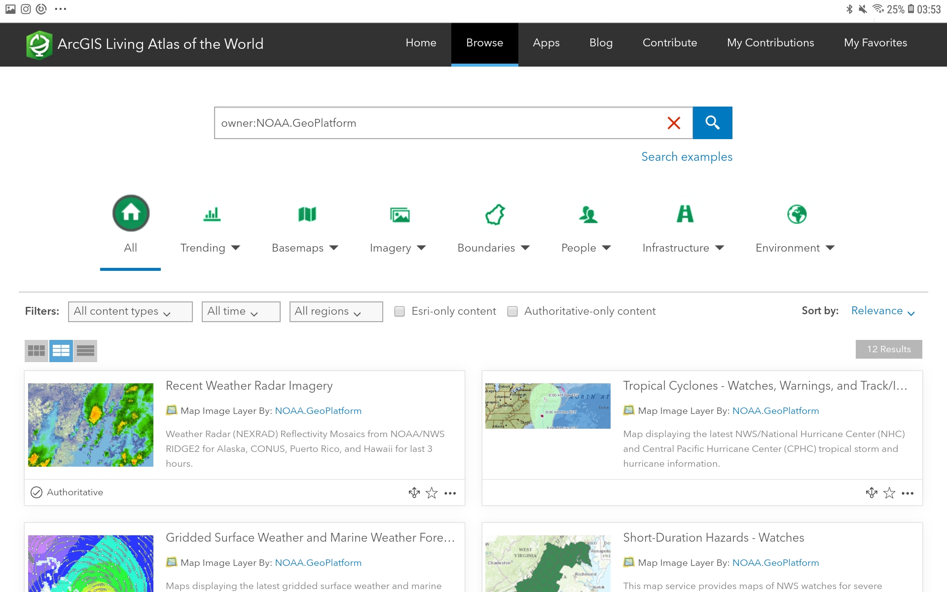

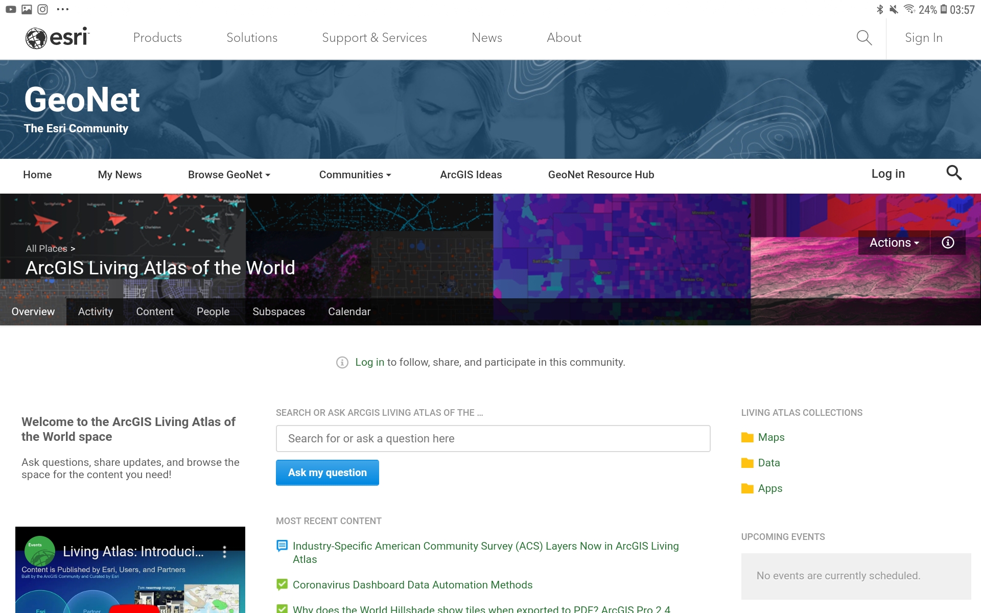
Beginning with a base layer map, the public profiles has a set number of premade ones in different graphical categories. You can then overlay your own data or data from their collaborators over your map to see the data enacted in either static or animated form. Their public collaborators apart from those involved in the community are the CDC, EEA, UK Education Schools-ESRI, David Rumsey Maps, and NOAA Geo platform. When I mentioned those involved in the community I’m referring to those in the GeoNet which is a online forum as well as a general contribution space for those working on personal projects compared to larger institutional projects. Now there’s different ways of overlaying data on the maps, you can use simple layers of data which would be images, boundaries and scenes. Or, you can use more advanced tools and app/story maps which would be the animated versions of your data. the tools require the use of their pro tools and the app/story layer doesn’t have a lot of information on what it is exactly, however, it does have quite a good source of information on how to use a manipulate it to your own data.
This sounds all well and good and there is a considerable amount you can do before hitting paywalls or the platform getting to levels of complexity that you’d need a team to help you work. Sadly there is a huge downside to this platform from a digital humanities stance, if you were to read the terms and conditions if registering on the platform you would see a clause there that states that “all esri offerings are copyrighted works if Esri or its licensors; all rights not specifically granted in the Agreement are reserved”. So in lamens, all data your ‘offer’ or input into the esri and ArcGIS platforms no longer belongs to you in the context of what you’re using it for, this does not mean that the data you collected seperately and then afterwards input into Esri is not yours as a whole, that data is still yours because you collected it independently to the platform, however, once you input it into a layer or map the specific data you put in is longer yours to make monetary gain off of in the context of what you put into the platform, if you have the exact same data somewhere else and are using it for monetary gain you are fine, once you make it clear that the data you put into esri was a reproduction of your own data and your data is then kept to you under copyright law.
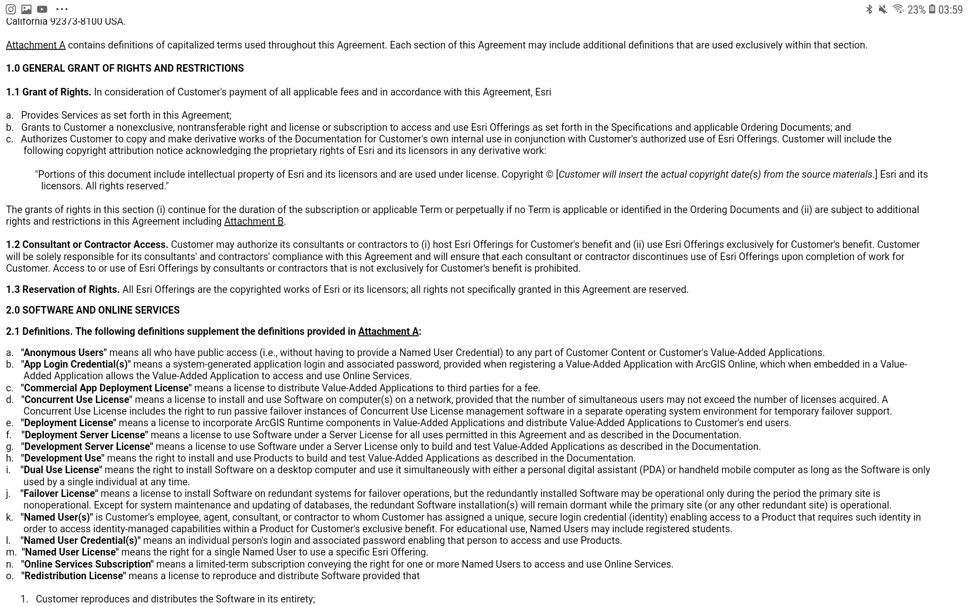
Esri states that companies once they inform Esri are allowed to hire contractors to use esri to create a tool for them using the platform however it once again can’t be used the the monetary gain of the customer, so this is an interesting dilemma because although you are no longer the main copyright holder of your data they are still ensuring that the data is not being used by corporations to make money.
Now that that is out of the way, we can begin to look at the Esri Collector tool, this is similar enough to Open Street Map in that it has a community driven aspect and uses maps, the similarities stop right about there. There are 2 different app versions of this available to download, the regular and the beta, you can only trial a few maps on the regular version of you have a public account and on the beta there is only 1-2 more maps to looks at and contribute to. It is to be expected that the UI on the beta version would be of a lower quality, although I expected a much smoother navigation and UI on the newer version (available since Oct 2019) which I must say it was not, the screen rotation was extremely glitchy and the maps did not load in great detail once you enhanced them to a certain point, there was no counter to show how much you had enhanced the map so it didn’t work well for distancing. To input something into Collector, such as a park, forest or whatnot, you had to be withing 30 metres of said point on the beta version and 10 metres on the newer version.The downside to this however is that the app on multiple occasions could only pinpoint me within 50 metres of my location so I was not eligible to add anything to the maps. There was no contribution to the map of Ireland on the beta version although there was a minimal amount added to the newer version. 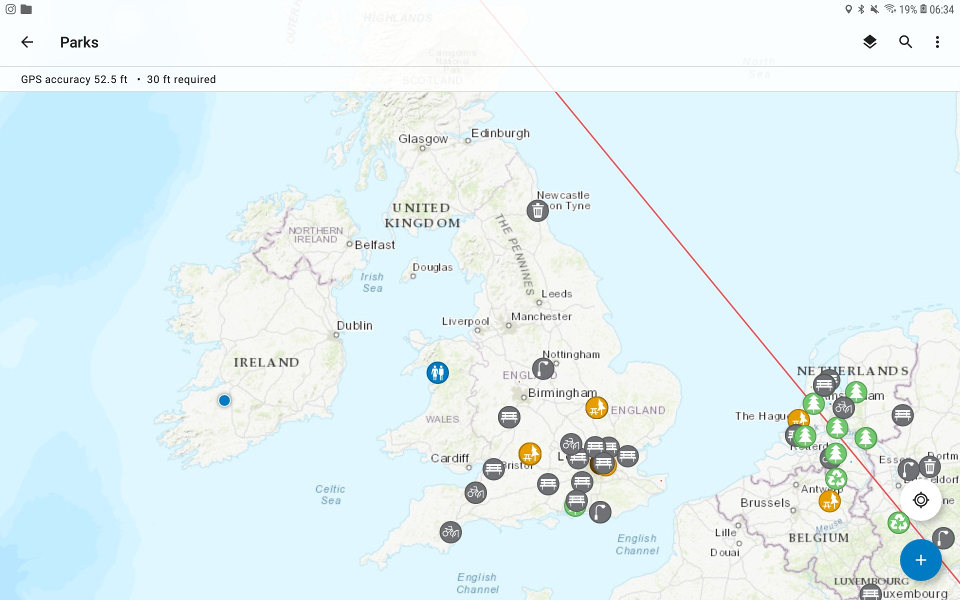
From reading through the blogs, it seems that with a corporate or credentialed account you can download sections of maps and share them with a team to mark out points on the map for data collection for various different areas of work. From what I heard from students in geography they only used the beta version seeing as it was the only one available at the time of their work. The beta once you play around with it a bit it easy enough to work around and is usable by those who aren’t used to digital tools.
There are forums to looks at and blogs to ask questions, this is on the GeoNet community, its nothing special and works the same as a regular academic forum for questions, comments, queries and theories.
When using the Collector you can change the look of the base map to your viewing preference, I found the topographical map useful for seeing mountainous areas however if you didn’t care to look at the lay of the land it was not easily readable for general collecting work. I changed the base to Firefly Imagery which was much easier to work with and loaded better and had quite a bit more clarity.
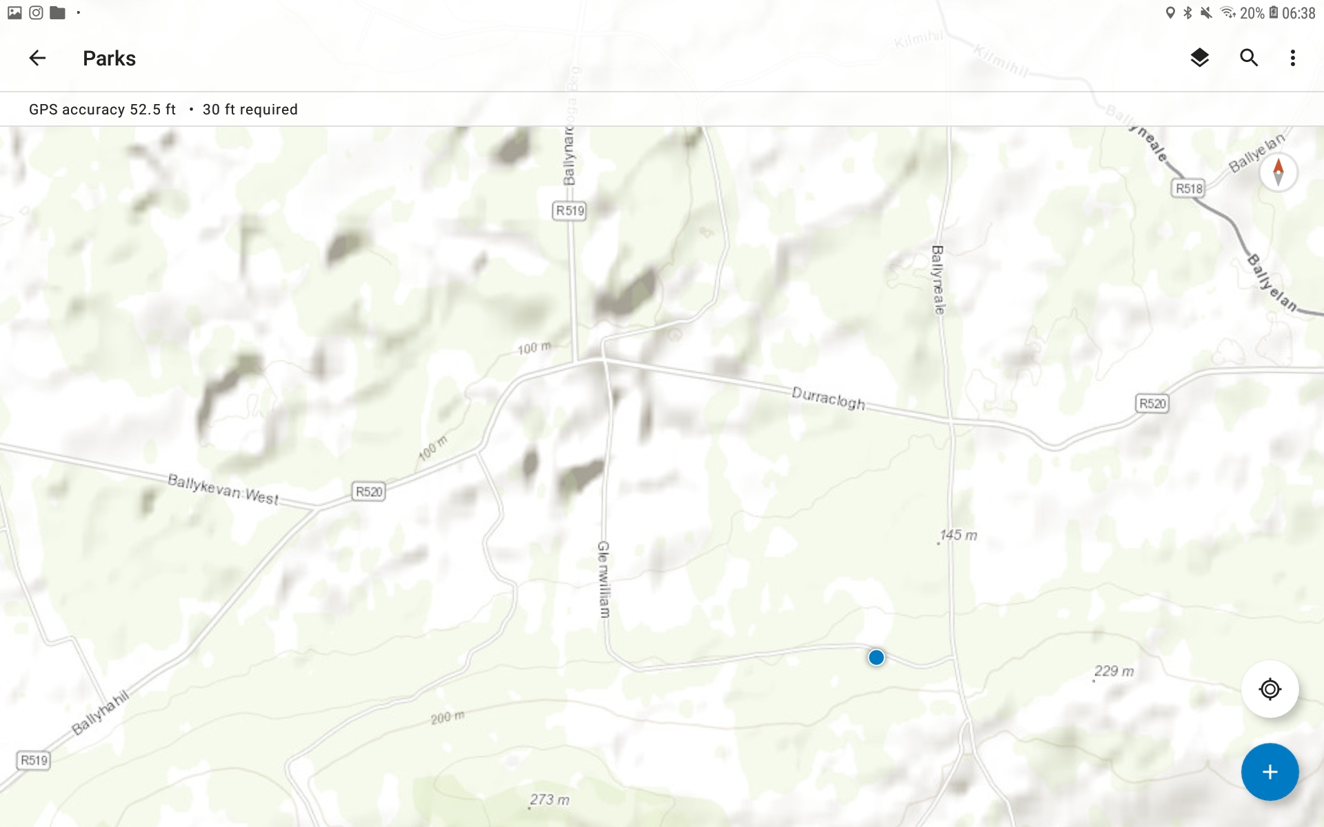
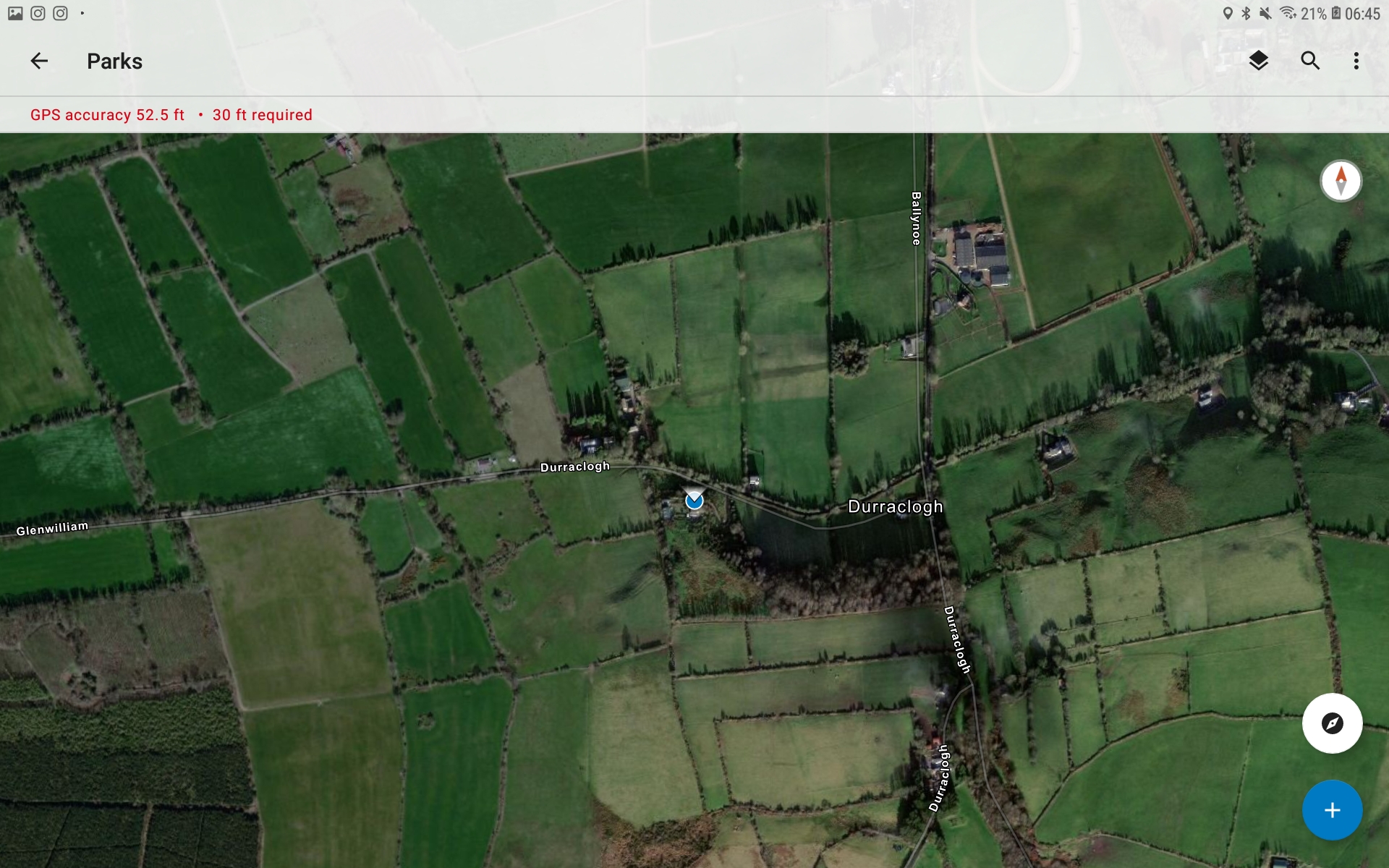
It did seem you were able to add audio, imagery and video of the areas you were collecting but due to the geolocating problems I was not able to test how well this aspect of the app worked. 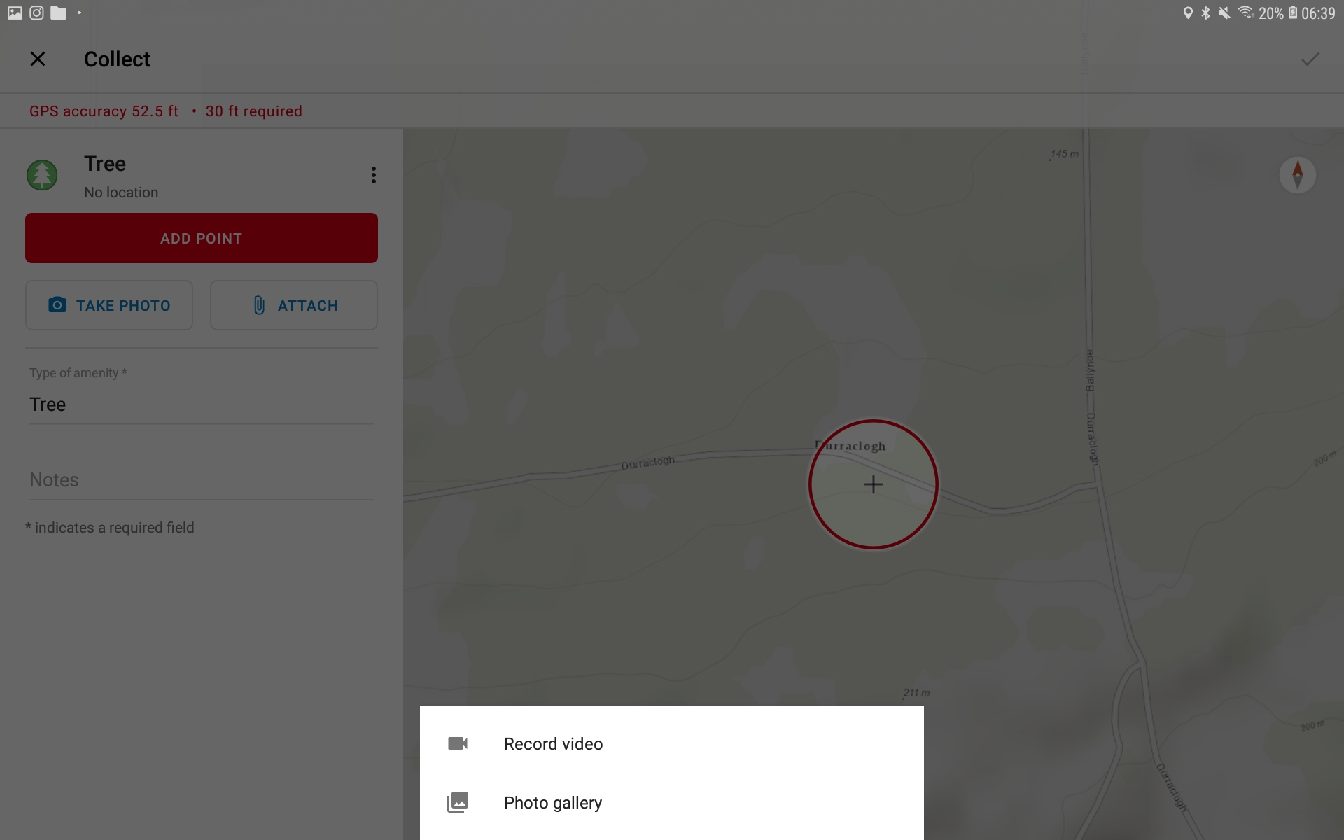
Why use this platform for digital humanities? Do we need it?
To be honest once I looked at other tools we had in our network I realised that this isn’t essential is an academic sense. You can create the same affect using Omeka and Neatline layered over Open Street Map. Though it may take longer and be slightly more complicated, it means you’re still in charge of your data and how it is used. Now saying this, the Esri/ArcGIS platform has everything you need there in one place and is pretty much the scratch of the data visualisation world, meaning it’s easy and fast to use for big corporations who don’t really mind that their data is being used and were they to make and Agreement with Esri can retain their copyright over the data, although this would most likely cost them a substantial enough amount of money.
In the case of DH, I personally don’t think it is essential at all for us to use this, we are small and can make equal representations easily enough in small teams using the tools we know, and that respect our data and our ownership of it.
